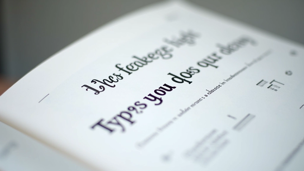
Readability Matters: Line Height, Spacing, and Sizing
The technical side of typography. We’ll explain why line height affects readability, how letter spacing impacts perception, and what size actually works on mobile.

Why These Numbers Matter
Good typography isn’t about picking a pretty font. It’s about making text easy to read. Line height, letter spacing, and font size work together to create the experience. Get one wrong and your content becomes a chore to read. Get them right and readers stay engaged.
The thing is, there’s no one-size-fits-all answer. A 14px body font with 1.4 line height works great for desktop but feels cramped on mobile. We’re going to walk through the actual numbers, show you what happens when you adjust them, and give you frameworks you can use for your own projects.

Line Height: The Space Between Lines
Line height is the vertical space from the bottom of one line to the bottom of the next. It’s usually expressed as a unitless number (1.5, 1.6) or as a percentage (150%, 160%). The unitless approach is better because it scales with the font size automatically.
For body text, most designers aim for 1.4 to 1.8. Too tight (like 1.2) and your eyes struggle to jump to the next line. You’ll see readers losing their place, having to reread sentences. Too loose (like 2.0) and the text looks sparse, disconnected.
The sweet spot for web: 1.5 to 1.6 for body text on desktop. On mobile, you might bump it to 1.65 because smaller screens need breathing room.
Headings? They work differently. An h1 or h2 usually sits around 1.1 to 1.3 because you want them tight, punchy. But if your heading wraps to multiple lines, drop it to 1.2 minimum or it’ll look awkward.
Letter Spacing: The Space Within Words
Letter spacing (also called tracking) is the space between individual letters. Most body text needs minimal letter spacing — usually 0 or very slightly positive. In CSS, that’s 0.02em to 0.04em if you need it at all.
Here’s where it gets interesting: different fonts need different spacing. A tight geometric sans like Futura wants slightly more space than a warm humanist like Calibri. You’ve got to test it. Set your text, zoom to 100%, and see if words feel cramped or loose.
For headings, you can go tighter or even negative. Many design systems use -0.02em on large headings for a confident, premium feel. But don’t overdo it — negative letter spacing on body text makes reading harder, not easier.
Mobile’s different again. Smaller text sometimes benefits from 0.01em to 0.03em positive spacing because the screen resolution is lower and letters can feel cramped.
Font Size: Getting the Scale Right
Body text for reading on screen should sit between 14px and 18px. Anything smaller feels cramped. Anything larger and you’re wasting screen real estate. Most of us land on 16px as the default, then adjust up or down from there.
But here’s the practical part: 16px on desktop is comfortable. 16px on a mobile phone at 320px width? That’s half the screen width per line of text. You need to think about line length too. The ideal is 50-75 characters per line. Count them. If your text hits 80+ characters, consider bumping the font size slightly or reducing the container width.
Use clamp() in CSS. It’s built for this. Instead of writing media queries for every breakpoint, use something like font-size: clamp(15px, 1vw + 14px, 18px). This scales smoothly between 15px on tiny screens and 18px on large ones.

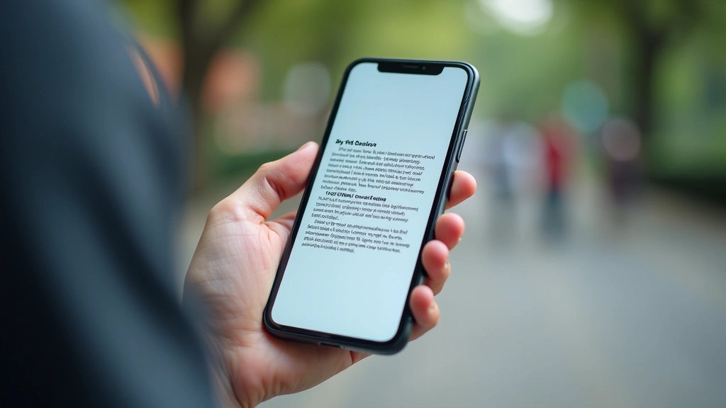
Mobile: Where Typography Matters Most
People read on phones in terrible conditions. Bad lighting, one hand, at arm’s length. Your typography has to work harder. Don’t just shrink desktop designs. Redesign them.
On a 375px screen (iPhone 12 width), a 14px font with 1.4 line height feels tight. Bump the line height to 1.65 or 1.7. Yes, it takes more vertical space, but readability improves. Mobile users expect to scroll anyway.
Container width matters too. Don’t let text span the full screen width on mobile. Use max-width: 100% on the container, but add horizontal padding so text never exceeds about 40-50 characters per line. At 375px width with 1rem padding on each side, you’ve got roughly 343px for text. At 15px font size with 1.65 line height, that’s about 45 characters per line. Perfect.
Practical Checklist for Your Projects
Body Text
- Font size: 16px (or clamp 15-18px)
- Line height: 1.5-1.6 desktop, 1.65-1.7 mobile
- Letter spacing: 0 or +0.02em
- Max width: 65-75 characters per line
- Color contrast: 4.5:1 minimum (WCAG AA)
Headings
- H1: 2.5rem (clamp 1.75-3.5rem)
- H2: 2rem (clamp 1.5-2.75rem)
- H3: 1.5rem (clamp 1.25-2rem)
- Line height: 1.1-1.3
- Letter spacing: 0 or -0.02em for premium feel
Testing
- Test at actual viewport sizes (not zoomed)
- Count characters per line
- Read a paragraph aloud
- Check contrast with WebAIM
- Test on actual phones, not just browser emulation
The Real Outcome
When you get line height, letter spacing, and font size right, something shifts. Readers don’t think about the typography. They just read. They finish articles. They stay on the page. They don’t have to reread sentences because they lost their place.
It’s not magic. It’s just respecting how humans actually read. You’re removing friction. Every adjustment — a slightly larger font, a touch more line height, proper spacing on mobile — is working toward the same goal: getting the content out of the way so people can focus on what you’re saying.
Start with the baseline numbers we’ve covered. Test them on your actual projects. Adjust. Iterate. Your readers will notice the difference even if they can’t name it. That’s how you know you’ve nailed it.


About This Article
This article provides educational information about typography principles and web design best practices. The recommendations here are based on widely accepted web standards and accessibility guidelines like WCAG. Every project is different — factors like font family, content type, and target audience may require adjustments to these baseline values. Always test your typography on actual devices and gather feedback from real users. This information is intended for learning purposes and should complement, not replace, professional design consultation for critical projects.