
Font Pairing Fundamentals for Web Design
Discover how to pair typefaces effectively for headings and body text. We break down serif, sans-serif, and display combinations that work.
Read ArticleMaster the science behind harmonious color combinations. Learn complementary, analogous, and triadic schemes that’ll transform your designs from good to genuinely great.

Here’s the thing about color — it’s not magic, but it feels like it. A palette that clicks makes your entire design feel intentional and professional. A palette that clashes? Everything falls apart, no matter how good your typography or layout is.
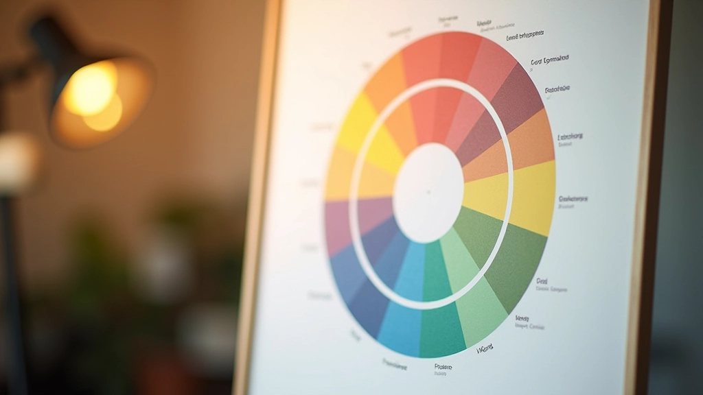
The difference isn’t luck. It’s understanding how colors relate to each other on the color wheel. You don’t need to be an artist. You just need to know the basic relationships that make combinations work together instead of fighting each other.

Color relationships are like musical chords. Some combinations are naturally harmonious, others create tension. Knowing which is which means you’ll stop guessing and start designing with confidence.
Colors opposite on the wheel — blue and orange, red and green. They create maximum contrast. Great for CTAs and emphasis, but use sparingly or everything screams for attention.
Colors next to each other on the wheel — blue, blue-green, green. They’re naturally harmonious and calming. Perfect for backgrounds and subtle variations, but can feel monotonous if you’re not careful.
Three colors equally spaced on the wheel — red, yellow, blue. Bold and balanced at the same time. Works well for vibrant designs but needs careful saturation control to avoid looking like a kindergarten classroom.
A color plus the two colors beside its complement. Less tension than pure complementary, more interesting than analogous. This is the goldilocks option for most projects.
Two colors can have the same relationship but look completely different based on saturation. You can pair a bright red with a muted teal and they work. Pair bright red with bright teal? That’s a headache waiting to happen.
This is where most palettes go wrong. Designers pick colors that are theoretically correct but all at the same saturation level. Everything feels equally loud. The trick is variation — if you’re using a bold saturated color, balance it with muted tones. Your eyes will thank you, and so will your users.
Pro tip: Try this in any design tool — take your main brand color at 100% saturation, then create variations at 60%, 40%, and 20%. You’ve just created an instant palette that harmonizes because the colors are literally the same hue at different intensities.
A beautiful palette that nobody can read is just expensive screen decoration. Contrast isn’t optional — it’s fundamental. We’re not talking about aesthetic contrast, we’re talking about WCAG standards. Minimum 4.5:1 for body text. That’s not a suggestion.
Here’s what this actually means: if your background is #f1f5f9 (light gray-blue), your text needs to be dark enough to pass that ratio. Most mid-tone colors won’t cut it. You need something like #0f172a (near-black blue). Yes, it looks stark on screen. Yes, people can actually read it.

Enough theory. Let’s build something. This is the actual process we use when starting a new project.
Start with one color that represents your brand or project mood. Don’t overthink it. If you’re designing a fintech app, you probably lean cool (blues, teals). A wellness brand? Warmer earth tones. That’s your anchor.
Decide if you want calm (analogous), balanced energy (split-complementary), or bold contrast (complementary). Most projects do better with analogous or split-complementary. Save full complementary for moments you want to grab attention.
Don’t use every color at full saturation. Take your secondary colors and desaturate them by 30-50%. This creates visual hierarchy and gives your palette breathing room. Bright color for CTAs, muted for backgrounds and supporting elements.
Put your text colors on your background colors. Actually use them. A palette that works in isolation might fail when you’re trying to read body copy on a light background. Adjust until it passes contrast standards and feels right.
You don’t need to memorize the color wheel. These tools do the math for you while you focus on what looks good.
Generate palettes by entering one color and selecting your relationship type. It’ll show you complementary, analogous, triadic options instantly. Free version is genuinely useful.
The traditional color wheel interface. Pick a color, choose your harmony rule, watch the wheel update. It’s not flashy but it works and integrates with Adobe apps.
WebAIM’s contrast checker. Input two colors and it tells you if you meet WCAG standards. Bookmark this. You’ll use it constantly.
Export your palette to CSS variables or JSON. Especially useful if you’re building design systems. Keeps your entire team on the same colors.
Browse thousands of palettes created by designers. Great for inspiration when you’re stuck. You can export any palette and use it as a starting point.
Figma, Sketch, XD — they all have built-in color utilities. Spend 30 minutes learning the color picker in your main tool. Most designers never do.
Theory is one thing. Actually using it is another. Let’s look at how this works in practice with three common project types.
SaaS Dashboard: Primary: #2563eb (blue). Secondary: #10b981 (analogous green) at 60% saturation for secondary actions. Neutral backgrounds at #f8fafc. Text: #1e293b on light, #ffffff on dark sections. Everything’s readable, nothing fights.
E-commerce Site: Primary: #dc2626 (red). Accent: #f59e0b (split-complementary amber) at 80% saturation for sale badges. Backgrounds: #ffffff and #faf5ff. The red grabs attention, amber supports it, neutrals keep it calm. Conversions improve because nothing’s overwhelming.
Content Blog: Primary: #7c3aed (purple). Secondary: #ec4899 (analogous pink) at 50% saturation. Backgrounds: #ffffff with #f3e8ff accent sections. Headers stand out, supporting colors guide attention without screaming. Readers stay longer because the visual hierarchy is clear.

You don’t need to master color theory to create good palettes. You just need to understand one relationship, stick to it, and vary your saturation. That’s genuinely it. Most beautiful palettes you’ve seen? They’re probably analogous or split-complementary with smart saturation choices.
The next time you’re starting a project, pick one color. Then spend 15 minutes exploring what harmonizes with it using one of those tools. Test contrast. Build a small palette of 4-5 colors with different saturation levels. You’ll be amazed how much more intentional your design looks.
Ready to apply this? Pick a project you’re working on and build a palette using these principles. Document it. Notice how your design improves when colors work together instead of competing.
Explore More Design ResourcesThis guide covers widely-accepted color theory principles used in professional design. Color perception varies based on individual vision, display calibration, and cultural context. Always test your palettes on real devices with real users. WCAG contrast standards referenced here are current as of 2026 and may change — check official guidelines before deploying production work. This content is educational and informational only.